2024 road and para-cycling road world championships: preliminaRy analysis
![]()
From Sept 21 to Sept 29, Zurich will welcome the 2024 road and para-cycling road world championships. To mark the occasion, my friends and I went to do the 2 first loops (“only” 140km, 1700m elevation) of the Elite Mens circuit that will start from Winterthur on Sept 29. 273km and 4470m of pure pleasure! I am not sure whether riders will have time to enjoy the view. At least I hope they have a better weather than us.
Circuit overview
Get the GPX file
The road circuit is available as GPX format, which can be imported by any route planner like Komoot or Strava … or with R :).
There are various way to read such format in R, as shown in this other article. For this blog post, we leverage the gpx package:
Code
zch_gpx <- read_gpx("GPX-22-Winterthur-Zurich-1.gpx")
glimpse(zch_gpx)
List of 3
$ routes :List of 1
..$ :'data.frame': 10687 obs. of 5 variables:
.. ..$ Elevation : num [1:10687] 438 438 438 438 438 ...
.. ..$ Time : POSIXct[1:10687], format: "2023-11-03 06:08:27" "2023-11-03 06:08:29" ...
.. ..$ Latitude : num [1:10687] 47.5 47.5 47.5 47.5 47.5 ...
.. ..$ Longitude : num [1:10687] 8.72 8.72 8.72 8.72 8.72 ...
.. ..$ extensions: logi [1:10687] NA NA NA NA NA NA ...
$ tracks :List of 1
..$ :'data.frame': 0 obs. of 4 variables:
.. ..$ Elevation: logi(0)
.. ..$ Time : logi(0)
.. ..$ Latitude : logi(0)
.. ..$ Longitude: logi(0)
$ waypoints:'data.frame': 9 obs. of 6 variables:
..$ Elevation : num [1:9] 464 411 411 411 411 ...
..$ Time : POSIXct[1:9], format: NA NA ...
..$ Latitude : num [1:9] 47.5 47.4 47.4 47.4 47.4 ...
..$ Longitude : num [1:9] 8.76 8.55 8.55 8.55 8.55 ...
..$ Name : chr [1:9] "km 0" "Info" "Info" "Info" ...
..$ Description: chr [1:9] NA NA NA NA ...We obtain a list containing 3 dataframes, namely routes, tracks and waypoints.
Visualize the route
In the following, we can visualize these data on an interactive map. To do so, I chose the leaflet package. First, we pass the data to leaflet(), then we select a map provider with addTiles(). I like to use the a rather light one as I want the user to focus on the route trace and not on any single mountain or village. Therefore, I went for the CartoDB.Positron tiles, which you can test here. The trace is injected with addPolylines, passing the Latitude and Longitude columns of our dataset, as well as few styling parameters such as color, line weight and opacity.
Then, we add the starting point and end point of the race available in zch_gpx$waypoints. Note that since the last loop goes 7 times around the finish line, the GPS coordinates are duplicated so we only extract zch_gpx$waypoints[1, ] and zch_gpx$waypoints[2, ]. Those data are given to the addCircleMarkers() function, which allows to pass extra information like popups or labels. Finally, I wanted to highlight the 4 most significant climbs of this tour:
- Buch am Irchel: 4.83km at 4.2%.
- Kyburg: 1.28km at 10.3%.
- Binz: 3.7km at 4.4%.
- Witikon: 2.63km at 5.3%.
I first had to locate the exact coordinates of each climb (the marker is put at the top). That’s the reason why you can see a few JavaScript lines at the end of the script. This is a helper passed to htmlwidgets::onRender(), which allowed me to click on the map and get the coordinates in an alert window.
function(x, el, data) {
    var map = this;
    map.on('click', function(e) {
        var coord = e.latlng;
        var lat = coord.lat;
        var lng = coord.lng;
        alert('You clicked the map at latitude: ' + lat + ' and       longitude: ' + lng);
    });
}
I then copied the results and passed them to addMarkers(). I faced some challenges while trying to get the markers render well when zooming in and out. Be careful to fix the X and Y anchors and specify the size of the icon you use:
icon = list(
    iconUrl = "https://www.vanuatubeachbar.com/wp-content/uploadleaflet-maps-marker-icons/mountains.png",
    iconWidth = 32,
    iconHeight = 37,
    iconAnchorX = 0,
    iconAnchorY = 0
)
The above setting ensures that at any level of zoom, the icon stays on the trace.
Code
leaflet(zch_gpx$routes[[1]]) |>
addTiles(
urlTemplate = "https://{s}.basemaps.cartocdn.com/light_all/{z}/{x}/{y}{r}.png",
attribution = '© <a href="https://www.openstreetmap.org/copyright">OpenStreetMap</a> contributors © <a href="https://carto.com/attributions">CARTO</a>',
options = tileOptions(
subdomains = "abcd",
maxZoom = 20
)
) |>
addPolylines(lat = ~Latitude, lng = ~Longitude, color = "#000000", opacity = 0.8, weight = 3) |>
addCircleMarkers(data = zch_gpx$waypoints[1, ], lat = ~Latitude, lng = ~Longitude, color = "#3eaf15", opacity = 0.8, weight = 5, radius = 10, label = "Start of race") |>
addCircleMarkers(data = zch_gpx$waypoints[2, ], lat = ~Latitude, lng = ~Longitude, color = "#e73939", opacity = 0.8, weight = 5, radius = 10, label = "End of race") |>
addMarkers(
lng = 8.64389380440116,
lat = 47.5413932128899,
icon = list(
iconUrl = "https://www.vanuatubeachbar.com/wp-content/uploads/leaflet-maps-marker-icons/mountains.png",
iconWidth = 32,
iconHeight = 37,
iconAnchorX = 0,
iconAnchorY = 0
),
label = "Buch am Irchel: 4.83km at 4.2% **"
) |>
addMarkers(
lng = 8.743660245090725,
lat = 47.45665840019784,
icon = list(
iconUrl = "https://www.vanuatubeachbar.com/wp-content/uploads/leaflet-maps-marker-icons/mountains.png",
iconWidth = 32,
iconHeight = 37,
iconAnchorX = 0,
iconAnchorY = 0
),
label = "Kyburg: 1.28km at 10.3% ****"
) |>
addMarkers(
lng = 8.624014738015832,
lat = 47.351512429613024,
icon = list(
iconUrl = "https://www.vanuatubeachbar.com/wp-content/uploads/leaflet-maps-marker-icons/mountains.png",
iconWidth = 32,
iconHeight = 37,
iconAnchorX = 0,
iconAnchorY = 0
),
label = "Maur-Binz: 3.7km at 4.4% **"
) |>
addMarkers(
lng = 8.607488349080088,
lat = 47.36219723777833,
icon = list(
iconUrl = "https://www.vanuatubeachbar.com/wp-content/uploads/leaflet-maps-marker-icons/mountains.png",
iconWidth = 32,
iconHeight = 37,
iconAnchorX = 0,
iconAnchorY = 0
),
label = "ZurichbergStrasse/Witikon: 2.63km at 5.3% **"
) |>
htmlwidgets::onRender(
"function(x, el, data) {
var map = this;
map.on('click', function(e) {
var coord = e.latlng;
var lat = coord.lat;
var lng = coord.lng;
console.log('You clicked the map at latitude: ' + lat + ' and longitude: ' + lng);
});
}"
)While the main climbs aren’t particularly difficult, except Kyburg, repeating them 7 times after more than 200km will be certainly challenging. Besides, we can’t only judge a climb by the average gradient as, sometimes a climb may be composed of a rather flat part, followed by very steep parts, making it more challenging than a regular gradient. That’s the case of the Buch am Irchel climb.
Buch am Irchel, Berg Am Irchel, Switzerland
• Distance: 4.8 km, Elevation: 201 m, Avg. Grade: 4.3 %
As a side note, the current GPX file indicates a duration of 8 hours, which gives roughly 35km/h average speed, substantially lower than what the pro will do during the race.
Code
duration <- max(zch_gpx$routes[[1]]$Time) - min(zch_gpx$routes[[1]]$Time)
avg_speed <- 275 / as.numeric(duration)
What about the elevation profile?
The previous map does not say much about the elevation profile. The cumulated positive elevation is obtained by summing the elevation difference between 2 consecutive time points, only taking positive results:
Code
gain <- 0
i <- 1
n_iter <- nrow(zch_gpx$routes[[1]]) - 1
while (i <= n_iter) {
    current_elevation <- zch_gpx$routes[[1]][i, "Elevation"]
    new_elevation <- zch_gpx$routes[[1]][i + 1, "Elevation"]
    diff <- new_elevation - current_elevation
    if  (diff > 0) gain <- gain + diff
    i <- i + 1
}
Note that the website gain is officially 4470m whereas ours is 4492m. This difference might be explained by the usage of different smoothing algorithms for the elevation. Funnily, we all had different bike computers and none of us had the same elevation result at the end of the ride.
We split the trace into 2 parts. The first loop takes place around Winterthur, north of Zurich. Then, a transition leads to the city loop, which is repeated 7 times.
Code
race_route <- zch_gpx$routes[[1]] |>
    filter(Time <= "2023-11-03 09:13:52")
city_circuit <- zch_gpx$routes[[1]] |>
    filter(Time > "2023-11-03 09:13:52")
ggplot() +
    geom_area(data = race_route, aes(x = Time, y = Elevation), fill = "darkblue") +
    geom_area(data = city_circuit, aes(x = Time, y = Elevation), fill = "darkred") +
    labs(
        title = "Zurich UCI 2024 Elevation profile",
        subtitle = "men elite race",
        caption = sprintf("Cumulated elevation: + %sm", round(gain))
    ) +
    ylab("Elevation (m)") +
    theme(
        axis.title.x = element_blank(),
        axis.text.x = element_blank(),
        axis.ticks.x = element_blank()
    )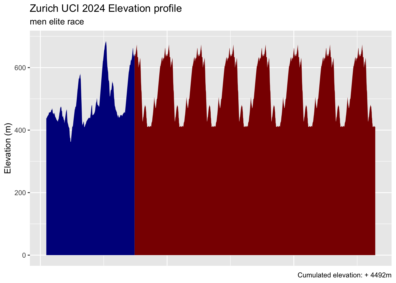
As you can see, altough the race never goes above 700m, we manage to reach 4500m elevation gain.
A 3D elevation profile with rayshader
We could cumulate both information about elevation and x and y coordinates to get the 3D profile with rayshader. The make_3d_plot function first creates a ggplot object using coordinates and color_col as color aesthetic. We set color_col to Elevation and hide the x and y axis information (as they won’t be very useful). Could you guess where (47.5, 8.4) is? Probably not :). This plot object is passed to plot_gg, to proceed to the 3D conversion.
Code
make_3d_plot <- function(dat, color_col, legend_title, scale = 150, show_legend = TRUE) {
    tmp_3d_plot <- ggplot(dat) +
 geom_point(aes(x = Longitude, y = Latitude, color = .data[[color_col]])) +
 scale_color_continuous(type = "viridis", limits = c(0, max(dat[[color_col]])), name = legend_title) +
 theme(
     axis.title.x = element_blank(),
     axis.text.x = element_blank(),
     axis.ticks.x = element_blank(),
     axis.title.y = element_blank(),
     axis.text.y = element_blank(),
     axis.ticks.y = element_blank(),
     legend.position = if (!show_legend) "none"
 )
 plot_gg(tmp_3d_plot, width = 3.5, multicore = TRUE, windowsize = c(1600, 1000), sunangle = 225, zoom = 0.40, phi = 15, theta = 80, scale = scale)
render_snapshot()
}

make_3d_plot(zch_gpx$routes[[1]], "Elevation", "Elevation (m)", show_legend = FALSE)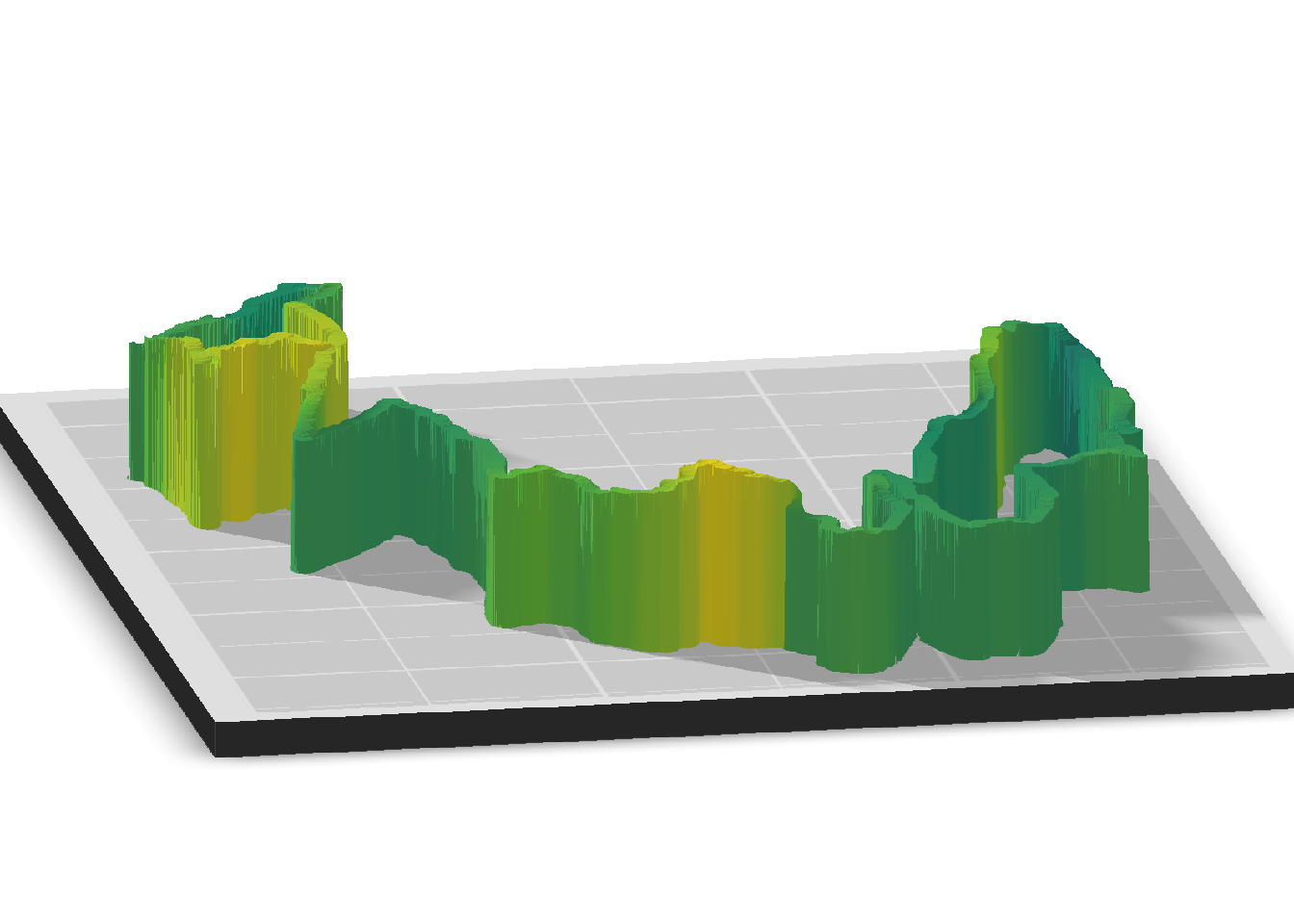
Wouldn’t it be nice to be able to move the plot around and have different angles? We can do this with the help of ggrgl, particularly the geom_path_3d(). We extract some Zurich’s canton cities and project them on the map with geom_point() and geom_text() to add annotations. Since this plot does not render with quarto, we included an image after the code.
Code
# https://simplemaps.com/data/ch-cities
ch_cities <- readr::read_csv("ch.csv")
zh_cities <- ch_cities |> filter(
    city %in% c("Zürich", "Winterthur", "Binz", "Uster", "Dübendorf", "Küsnacht")
)
p <- ggplot(zch_gpx$routes[[1]]) +
  geom_path_3d(
    aes(Longitude, Latitude, z = Elevation),
        extrude = TRUE, extrude_edge_colour = 'grey20', extrude_face_fill = 'grey80',
    extrude_edge_alpha = 0.2) +
  geom_text(data = zh_cities, aes(lng, lat, label = city)) +
  geom_point(data = zh_cities, aes(lng, lat), colour = 'red') +
  theme_ggrgl() +
  labs(
    title = "Elevation 3D profile",
    subtitle = "World UCI road men elite 2024, Zurich"
  )
devoutrgl::rgldev(fov = 30, view_angle = -30)
p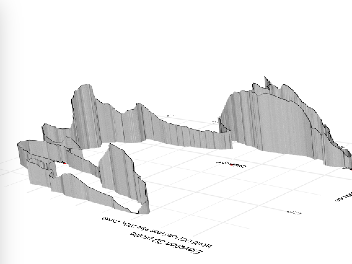
On the left, you can notice the steepest climb (Kyburg), that connects the two loops. I highly recommend you to play around locally so you can try out different angles and explore the different parts.
Overall, 4490m for 275km is definitely not the most hilly ride for professional athletes, compared to the amateur Alpen Brevet Platinium, which offers 275km for 8907m elevation, just a tiny bit higher than Mount Everest. Here again, it all depends on the average speed at which this race will go. I personally expect a value between 40-42km/h, depending on the weather conditions (rain, wind, …). Let’s see …
The ride
FIT TO CSV
In the below section, we analyse few logs of my ride, which are extracted from the my bike GPS fit file. We first convert this file to a format that R can read, for instance csv. I used this website, but you can also find cli alternatives like here.
Code
# A tibble: 6 × 123
  GOTOES_CSV timestamp           position_lat position_long altitude heart_rate
  <lgl>      <dttm>                     <dbl>         <dbl>    <dbl> <lgl>
1 NA         2024-09-08 00:38:50         47.4          8.55     438. NA
2 NA         2024-09-08 00:38:51         47.4          8.55     438. NA
3 NA         2024-09-08 00:38:52         47.4          8.55     438. NA
4 NA         2024-09-08 00:38:53         47.4          8.55     438. NA
5 NA         2024-09-08 00:38:54         47.4          8.55     438. NA
6 NA         2024-09-08 00:38:55         47.4          8.55     438. NA
# ℹ 117 more variables: cadence <dbl>, distance <dbl>, speed <dbl>,
#   power <dbl>, compressed_speed_distance <lgl>, grade <dbl>,
#   resistance <lgl>, time_from_course <lgl>, cycle_length <lgl>,
#   temperature <dbl>, ...17 <lgl>, ...18 <lgl>, ...19 <lgl>, speed_1s <lgl>,
#   cycles <lgl>, total_cycles <lgl>, ...23 <lgl>, ...24 <lgl>, ...25 <lgl>,
#   ...26 <lgl>, ...27 <lgl>, ...28 <lgl>, ...29 <lgl>, ...30 <lgl>,
#   compressed_accumulated_power <lgl>, accumulated_power <lgl>, …
We select only few interesting columns for the analysis and also remove the 43 minutes coffee break we took in the middle of the ride in Kyburg’s castle:
Code
res <- res |>
    tibble::rowid_to_column() |>
    mutate(
        Latitude = position_lat,
        Longitude = position_long,
        distance = distance / 1000,
        timestamp = case_when(rowid >= 9017 ~ timestamp - 43 * 60, .default = timestamp)
    ) |>
    select(timestamp, cadence, distance, speed, grade, power, temperature, calories, altitude, Latitude, Longitude)
Data summary
Below are some continuous variable summary using gtsummary. Notice the maximum gradient which was 18.2%! The overall ride has a 1.1% grade, which means there is more climbings than downhills.
Code
res |>
  tbl_summary(include = c(speed, cadence, grade, power), type = all_continuous() ~ "continuous2",
    statistic = all_continuous() ~ c("{mean}", "{min}", "{max}"),
    missing = "no",
    label = c(speed ~ "Speed (km/h)", cadence ~ "Cadence (RPM)", grade ~ "Grade (%)", power ~ "Power (Watts)")
  ) |>
    modify_header(label ~ "**Variable**") |>
    modify_caption("**Table 1. Ride summary**") |>
bold_labels()| Variable | N = 17,356 |
|---|---|
| Speed (km/h) | |
| Mean | 27 |
| Minimum | 0 |
| Maximum | 68 |
| Cadence (RPM) | |
| Mean | 61 |
| Minimum | 0 |
| Maximum | 110 |
| Grade (%) | |
| Mean | 1.1 |
| Minimum | -14.4 |
| Maximum | 18.2 |
| Power (Watts) | |
| Mean | 151 |
| Minimum | 0 |
| Maximum | 701 |
Power analysis
Background
Power measures how much work is done at a given time (in our case, on the bike). It is expressed in Watts (W. 1W = 1J/s). Power is expressed as follows:
P = Strength x velocityThere are 2 ways to rise the power. At low velocity by putting more strength or increase the velocity while applying the same strength.
In cycling, we also calculate the Power/Body Weight ratio, as from physiological point of view, the more muscles, the more theoritical power. This is important in the climbs, where, because of the gravity, the weight becomes more important as the gradient increases. Therefore, taking cyclist 1 (bodyweight + bike 60kg) and cyclist 2 (bodyweight + bike 90kg) side by side on the same climb with similar bikes, cyclist 2 has to produce more power to climb at the same speed as cyclist 1.
Therefore, a 58kg pro cyclist climber and 100kg pro track cyclist may have similar power ratio for a given duration, even though the former will likely be better at longer efforts. Talking about power without considering the effort duration does not make much sense. World class women cyclists can sustain > 19W/kg during 5s (1360 for a 70kg athlete), men cyclists can sustain 24 W/kg during 5 seconds (2160W output for 90kg).
We won’t have time to cover all the theory, but keep in mind that knowing your threshold power (FTP) is critical for successful training. This is the power you can theoretically sustain for 1h. Based on this, one can establish power zones to plan the training. For profesional riders, FTP are respectively > 5W/kg for women and > 5.8 W/kg for men. You can find more here.
Results
To proceed, we create a plot showing the power as a function of the distance. We also add the elevation profile in the background with geom_area() with a rather transparent alpha setting, so the user can focus on the power data. We add some geom_smooth() to see the relation between the power and distance ()power ~ distance) and display the mean power on an horizontal line with geom_hline(). On the second plot, we want to show the power distribution and leverage geom_histogram, the idea being to compare the mean power to the threshold power.
The power chart shows that my power is decreasing over time, not a surprise. There is an effect of the fatigue but also the weather conditions, as the last part of the ride was in the city and under heavy rain and we had to adjust the speed not to take too much risks. Besides, when looking at the power distribution, we notice that the average power is significantly below my threshold power (FTP), which is my theoretical maximum power for 1h. For a 5h ride, this makes sense as one wants to save energy to last as long as possible.
Code
make_time_plot <- function(dat, col, show_elevation = TRUE, elevation_scale = 1) {
    p <- ggplot(dat, aes(x = distance, y = .data[[col]])) +
    geom_line() +
    geom_smooth(method = "lm") +
    geom_hline(yintercept = mean(dat[[col]]), linetype = "dashed", color = "darkred")

    if (show_elevation) p + geom_area(aes(x = distance, y = altitude / elevation_scale), alpha = 0.15) else p
}

make_distrib_plot <- function(dat, col) {
    ggplot(dat, aes(x = .data[[col]])) +
    geom_histogram() +
    geom_vline(xintercept = 250, linetype = "dashed", color = "darkgreen") +
    geom_vline(xintercept = mean(dat[[col]]), linetype = "dashed", color = "darkred")
}

power_time <- make_time_plot(res, "power") +
    annotate(
        "text",
        x = 10,
        y = 400,
        label = "Average power",
        fontface = "bold",
        color = "darkred",
        size = 4.5
    ) +
    ggtitle("Power over time") +
    xlab("Distance (km)") +
    ylab("Power (Watts)")

power_distrib <- make_distrib_plot(res, "power") +
    annotate(
        "text",
        x = 310,
        y = 2500,
        label = "Threshold power (FTP)",
        fontface = "bold",
        color = "darkgreen",
        size = 2.5
    ) +
    annotate(
        "text",
        x = mean(res$power) + 20 - 60,
        y = 2500,
        label = "Average power",
        fontface = "bold",
        color = "darkred",
        size = 2.5
    ) +
    theme(
     axis.title.y = element_blank(),
     axis.text.y = element_blank(),
     axis.ticks.y = element_blank()
    ) +
    ggtitle("Power distribution") +
    xlab("Power (Watts)")

power_time / power_distrib + plot_annotation(
  title = "Power data",
  subtitle = "Elevation data shown in the background",
  caption = "More about power: https://support.strava.com/hc/en-us/articles/216918457-Power"
)
Speed
Code
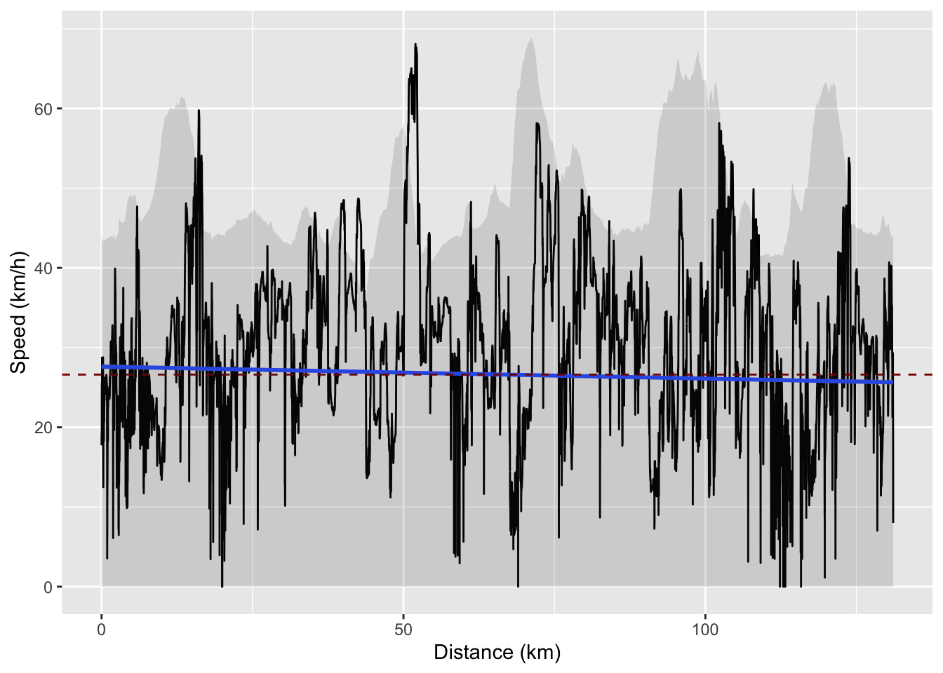
The ride was covered at 27km/h average speed on an open road with wind and rain, definitely not the best conditions.
Interestingly, I found this nice article about the relation between power and speed. Overall, the simulator predicts 150W to maintain an average speed of 27km/h with a 0.5% gradient coefficient, not far from what we have here. It’s rather challenging to account for the wind, as it can sometimes help or makes things more challenging.
Calories
During that ride, I consumed about 2549 calories, which corresponds to the average daily energy needs for an adult man.
Conclusion
This was a lot of fun to ride part of this upcoming event, even more to analyse the underlying data.